New Designs
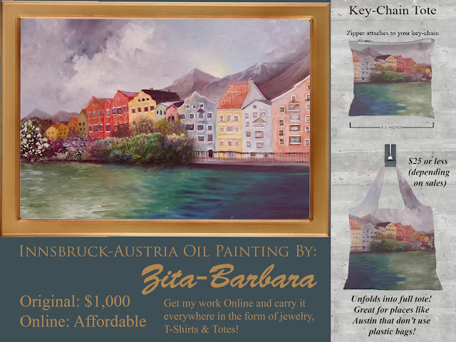
When I created this oil painting (above) I was at the University of Texas-San Antonio. I was taking an advanced painting class. The entire class grade was based on "critique." Personally, I like colorful town paintings that one might see at home goods stores. I gravitated towards painting this image off a photo I took while I was in the University of Innsbruck, Austria for a summer of 2007. This is a small town that has a beautiful waterfront nestled by the German Alps. The clouds on this day looked especially wispy and lush at the same time. Maybe the assignment in my painting class was to capture texture? I made sure to capture the clouds and choppy water. Looking back on my college paintings, I am still critical of myself. I ask why I didn't decided to place the reflection of the houses' colors on the water?
I got a "B" for the painting in class. To me, it wasn't a "good grade." I was making a 4.0 in all my art courses at that point, so I snubbed my nose up at "B."
The criticism I got was:
"It looks like something you could find at a home goods store."
Ironic...because that is exactly what I was going for. I thought that was a compliment...it wasn't. The class thought my painting was boring.
A suggestion from the class critique to place a drowning "Ophelia" (popular figure from Romanic Art and Shakespeare's Hamlet) emerging from the water to make my painting "more interesting." I guess that would be one way to go about making something more interesting. Imagine if we applied that to real life situations?
Hank: This party blows...
Friend of Hank: That's because no one is drowning themselves in the pool.
Hank: That would make things more interesting...
You see where I am going with this? I feel like adding something like "Ophelia" is very forcibly making something "more interesting" for the sake of it.
Since this painting was not well received, I tucked it away. I thought it didn't deserved to be admired because clearly my painting class did not like it...so it must not be that good. Many years later, a friend dropped it off from my mom's house (my mom-who actually displayed it) and this friend said, "I really like this one. Let me know if I can buy it?"
At that point I haven't seen this painting in a while...and looked at it again...
It was good! Why didn't I like it? Because my art class didn't? To me, it reminds me of a time of my life, a first trip to study abroad in Europe. I liked it. I chose to make it into one of my "VIDA" fashions when another friend (who might be German) had posted this exact waterfront on her Facebook page. I was amazed someone else visited Innsbruck. She told me her goal was to eventually move there. I was surprised that someone enjoyed this little province as much as I did. I realized, that even when a painting of a town might look like "any other painting of a town" to art students...it is not to people who have visited the town. To me, and to this friend, this represents a place that holds many memories.
I decided to finally like my own painting and make it available in many home items: kitchen mitts, coffee cups, plates, trays, and even the full high-quality print for a wall!
Also available, are softer items like throw pillows and scarfs. Every once in a while, I order my own products to "see" the quality for myself before asking people to buy something from my collections. These are close-up photos of my work on a set of tea towels (kitchen towels.) Looking at them close-up, it is apparent that the brushwork from the painting was captured. So all that work I put into creating the "choppy waves" or the different colors I used to make the impasto waterfront homes readily shows. I am a happy camper! I strongly recommend this set to anyone who loves Austria/Germany type settings and decor.
If you like this design, the entire collection is available here:


Comments
Post a Comment